
WORKSHOP
Old Order History

Orders appeared as dense rows of data with product details hidden behind clicks, forcing customers to remember order dates or totals just to locate the purchase they needed.
Before expanding the feature to include store purchases, we redesigned the foundation of order history so customers could quickly recognize the order they were looking for.
The original ask was simple: add store purchase history to the existing order history page. The existing page made it impossible to do that well. Orders appeared as dense rows of data with product details hidden behind clicks, forcing customers to remember order dates or totals just to locate the purchase they needed.
UX partnered with product and engineering to reframe the initiative from a feature add into a foundational redesign, one that improved findability, reduced customer effort, and set the groundwork for supporting both online and in-store purchases without repeated rework later.
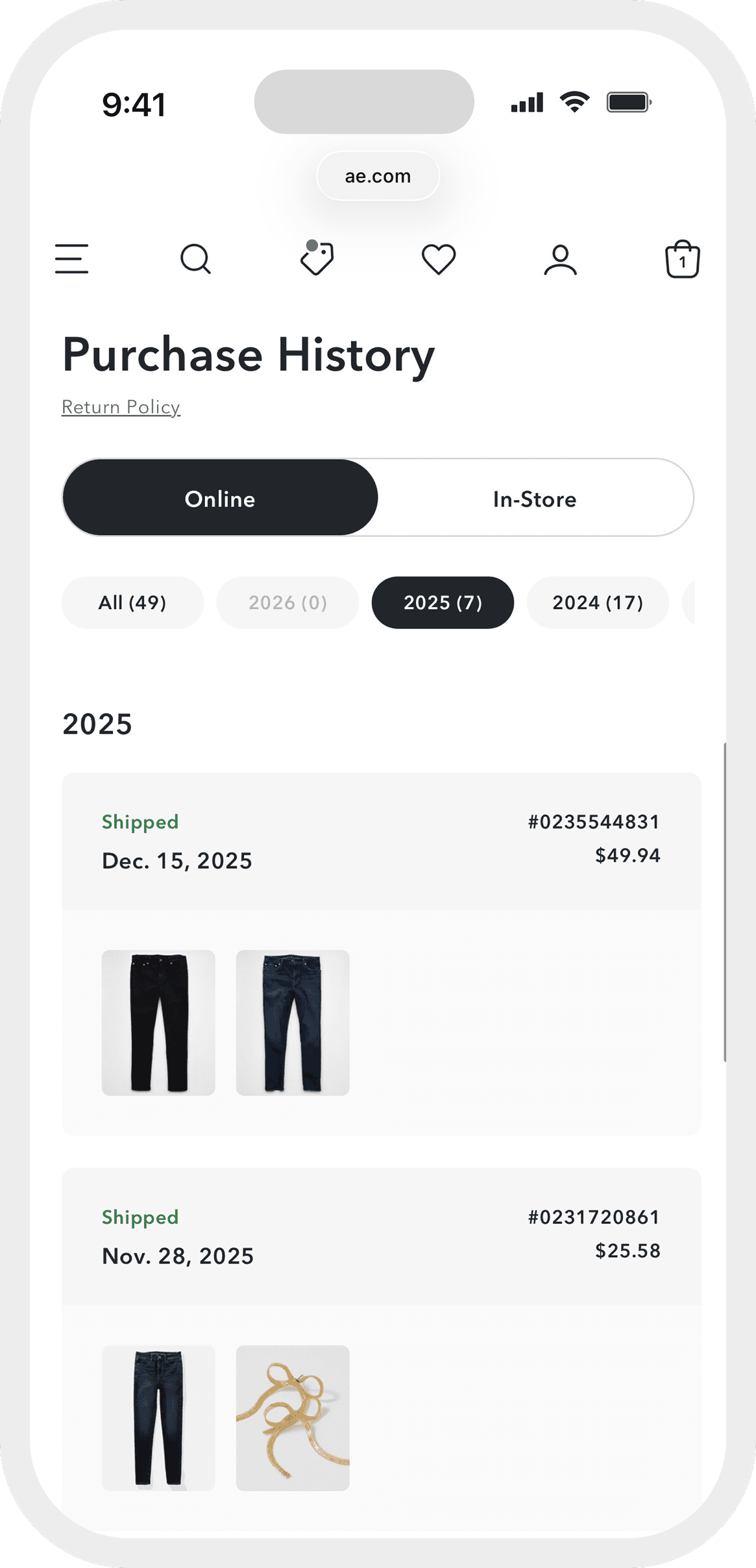
The existing experience treated order history like a database export. Every piece of data was present but nothing was prioritized. The redesign flipped that: lead with what customers use to recognize an order, not what's easiest to store.
Orders displayed in spreadsheet rows. Product images hidden behind clicks. No visual anchors. Customers had to remember dates or prices to find what they needed. That is recall-based design in a recognition-based context.
Front-facing product images for up to five items per order. Order number, status, date, and total surfaced immediately. Condensed card layout replacing spreadsheet rows. The same framework built to support online and in-store purchases without redesigning later.


